
Data Detectives: collect, chart and predict
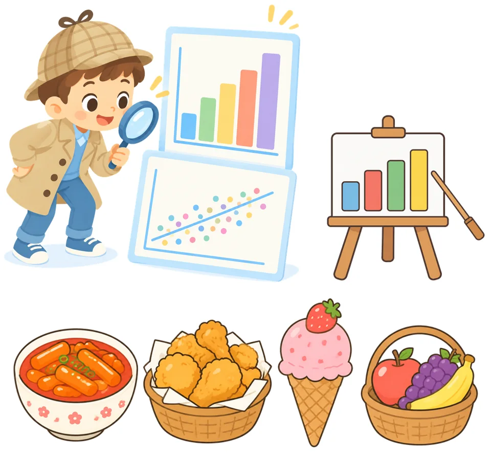
What is our class's favorite snack? Collect votes, draw charts with blocks, and make a prediction with a rubber-band experiment!
What you'll learn
- Collect data about a question and organize it in a table
- Choose a chart that suits the data and draw it with blocks
- Explain data with the average and the maximum
- Read a scatter plot, make a prediction and compare it with a measurement
You need
- PC or tablet with Chrome
- CuroAI Studio (curoai-studio.cubroid.com)
- Lesson 2, per team: rubber band, paper cup, 8 coins, 30 cm ruler, tape
Be a data detective
Notes for teachers
Grades 4–6, two 40-minute lessons. Lesson 1: collect votes, draw charts, read the average and the maximum. Lesson 2: a rubber-band experiment, a scatter plot and a prediction. No Cubroid blocks are needed: everything runs in CuroAI Studio in the browser.
Math (data and probability): bar graphs, averages, and choosing a suitable graph for an inquiry question. Korean curriculum [4수04-01], [6수04-01], [6수04-03].
Avoid surveys that reveal personal information (weight, test scores). A strong correlation does not mean that one thing causes the other. If the votes double when the flag is clicked again, check that “clear all data” is at the start.
What is data?
Data is numbers or facts that we collect by observing or investigating, to find out what we are curious about.

Today's question: what is our class's favorite snack?
Three steps for data detectives
 1. Collect dataAsk a question. Count and record.
 2. Draw a chartUse blocks to show the data as a chart.
 3. Read the chartFind the maximum and the average. Explain your answer.
Get ready
Open CuroAI Studio
Open curoai-studio.cubroid.com in Chrome. You do not need to install anything or log in.
Add the Data Chart extension
Click “Add Extension” at the bottom left, open the “Data” tab and choose “Data Chart”. A new “Data Chart” group appears at the bottom of the block list.
Class snack vote
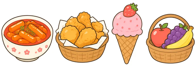
Choose 4 snacks and give each one a number key from 1 to 4.
Start with an empty chart
When the flag is clicked: clear all data, set the chart title and show a bar chart.
💡 Put “clear all data” first. Then the votes do not pile up when you click the flag again.
when @greenFlag clicked :: hat events
clear all data :: #1f8bf0
set chart title to [Our class snack vote] :: #1f8bf0
show [bar v] chart :: #1f8bf0
One key, one vote
When a number key is pressed, add 1 to that snack.
when [1 v] key pressed :: hat events
add (1) to [Tteokbokki] :: #1f8bf0

when [2 v] key pressed :: hat events
add (1) to [Chicken] :: #1f8bf0

when [3 v] key pressed :: hat events
add (1) to [Ice cream] :: #1f8bf0

when [4 v] key pressed :: hat events
add (1) to [Fruit] :: #1f8bf0
Vote and watch the bars grow
Take turns pressing a number key. Each press adds one vote.
Wow! Tteokbokki is in first place right now!
Read the charts
Choose a chart
In the chart block you can choose bar, line or pie. The table block shows the values as a table.
show [bar v] chart :: #1f8bf0

show [line v] chart :: #1f8bf0

show [pie v] chart :: #1f8bf0

show table :: #1f8bf0
Compare the totals of each group.
Show changes over time.
- Tteokbokki 35%
- Chicken 27%
- Ice cream 23%
- Fruit 15%
Compare parts of a whole.
| Snack | Votes |
|---|---|
| Tteokbokki | 9 |
| Chicken | 7 |
| Ice cream | 6 |
| Fruit | 4 |
Read the exact values.
Bar or line?
One bar is one snack. A taller bar means more votes.
Snacks have no order, so a line between them means nothing.
Speak with numbers: average and maximum
Show the average and the maximum
Tick the boxes next to the average and maximum blocks. Their values appear on the stage.
(average :: #1f8bf0)

(maximum :: #1f8bf0)
QWhat is the average number of votes?
Show answer
6.5 votes — (9 + 7 + 6 + 4) ÷ 4 = 6.5
QWhich snack has the most votes? How many?
Show answer
Tteokbokki, 9 votes — The maximum block shows 9.
QWhich snacks have more votes than the average?
Show answer
Tteokbokki and chicken — 9 and 7 are more than 6.5. Ice cream (6) and fruit (4) are less.
QDescribe the result in one sentence.
Show answer
Example — Our class likes tteokbokki the most.
Stretch, measure, predict
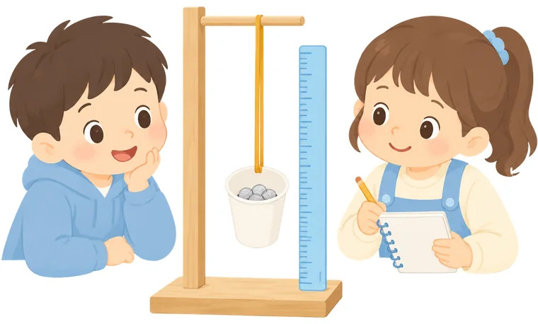
How much does the rubber band stretch each time we add a coin?
Plan the experiment
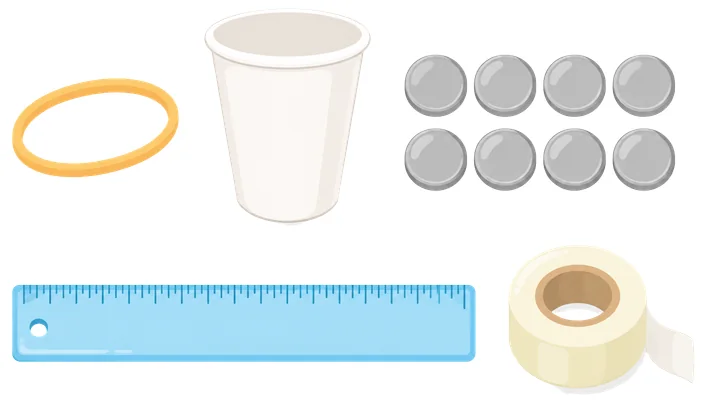 What do we need?
- 1 rubber band, 1 paper cup, 8 coins of the same kind
- 30 cm ruler, tape, record sheet
- Hang the paper cup on the end of the rubber band.
- Put in coins one by one and measure the length.
- Write each length on the record sheet.
💡 Do not pull the rubber band hard or snap it. No coins? Use the example data below.
Record and predict
| Coins | Length (cm) |
|---|---|
| 0 | 10.2 |
| 1 | 11.0 |
| 2 | 13.1 |
| 3 | 13.6 |
| 4 | 15.9 |
| 5 | 16.2 |
Before you measure: how long will it be with 8 coins? Write down your guess.
Show it as points
Load the points and show a scatter plot
Write the record in the load points block as “coins,length;” pairs. Then show the scatter plot.
💡 The predict block uses the trend line. Put in 8 to predict the length with 8 coins.
when @greenFlag clicked :: hat events
clear all points :: #1f8bf0
set chart title to [Coins and rubber-band length] :: #1f8bf0
load points [0,10.2;1,11.0;2,13.1;3,13.6;4,15.9;5,16.2] :: #1f8bf0
show scatter plot :: #1f8bf0
set [prediction \(8 coins\) v] to (predict y when x = (8) :: #1f8bf0) :: variables
x: number of coins · y: length (cm) · yellow dot: prediction for 8 coins
Read the scatter plot
QWhat does one dot show?
Show answer
One measurement — The number of coins (x) and the length (y) at that time.
QWhat happens to the length when there are more coins?
Show answer
It gets longer — The dots go up to the right.
QWhat is r? What does it mean?
Show answer
0.98 — It is close to +1, so the two values grow together strongly.
QPredict the length with 8 coins.
Show answer
About 20.4 cm — This is the value from the predict block.
Predict, then check
Now put 8 coins in the cup and measure. How close is it to the prediction?
💡 Could we predict 100 coins? Only as a thought experiment: the rubber band may break, and predictions far outside the measured data can be wrong.
Compare patterns
Data can have different relationships. Look at how the dots line up.
Coins and length
Our experiment
Temperature (°C) and hot chocolate sales
Example data
Shoe size (mm) and favorite number
Example data
💡 A relationship does not prove that one thing causes the other.
Our school, our data
Is there anything we can investigate with data at our school?
Try a mission
Mission 1Ask about favorite seasons and show the answers in a pie chart.
Mission 2Draw a line chart of this week's temperatures with the weather extension.
Mission 3Stack paper cups, measure the height of the tower and predict with a scatter plot.
💡 Choose questions that everyone can answer comfortably and anonymously. Do not collect personal information.
Review
Collect → chart → read. Data can help us make predictions, and we check them with real measurements.
Lesson complete!
Built it, coded it and tested it? Tap to save your progress.